Quantifying Relationships
In the previous sections, we were only able to say something about a specific data set. Often, you will want to quantify the relationship between data sets and the variables they contain. This allows us to look into things such as correlations (how one variable changes with respect to another) and attempt to make predictions for future behavior.
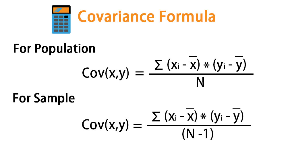
The covariance is a statistic for quantifying the relationship between variables. Here is the formula:
The magnitude of the covariance isn’t easy to interpret, but its sign tells us if the variables are positively or negatively correlated. However, we would also like to quantify how strong the relationship is between variables, which brings us to correlation. Correlation tells us how variables change together both in direction (same or opposite) and in magnitude (strength of relationship). To find correlation, we calculate the Pearson correlation coefficient by dividing the covariance by the product of the standard deviations of the variables in question:
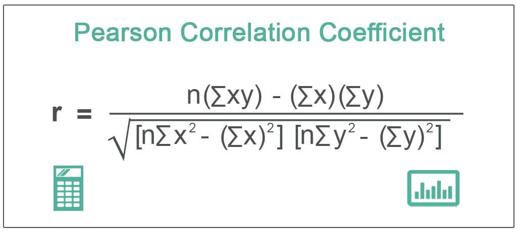
Don’t worry – I won’t make you calculate the Pearson correlation coefficient by hand. You should know that this formula normalizes the covariance and results in a statistic bounded between -1 and 1, making it easy to describe both the direction of the correlation (sign) and the strength of it. Correlations of 1 are said to be perfect positive (linear) correlations, while those of -1 are perfect negative correlations. Values near 0 aren’t correlated. If correlation coefficients are near 1 in absolute value, then the variables are said to be strongly correlated; those closer to 0.5 are said to be weakly correlated.
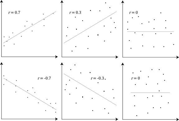
Let’s look at some examples using scatter plots. Examine the rho values to see how the variables are correlated to one another:
One very important thing to remember is that, while we may find a correlation between X and Y, it doesn’t mean that X causes Y or Y causes X. There could be some Z that actually causes both; perhaps X causes some intermediary event that causes Y or perhaps it is actually all just coincidence. We often don’t have enough information to confidently say one causes the other!
To quickly eyeball the strength and direction of the relationship between two variables, we will often use scatter plots rather than calculating the exact correlation coefficient. This is for a couple reasons:
It’s easier to find patterns in visualizations (it takes more work to identify these patterns in numbers and tables).
We might see that the variables seem related but they may not be linearly related. A visual can help us clarify if the relationship is something like exponential, logarithmic, etc.
Need to make a scatter plot in Google Sheets? Check this out: https://productivityspot.com/scatter-plot-google-sheets/
Ultimately, we will see that visualizing data is not optional – you should do it every time you are trying to make sense of a data set! This is so important, we will focus on visualizing data sets with Python for the rest of the semester. :)